
Main Content
ATENDIMENTO REMOTO
Catalogação, organização e localização de itens para organização de eventos e ambientes de exposição conectados.

CONECTE SUA ESTANTE
Hospedagem para criação de exposições conectadas. Cada item, coleção e lugar são compartilhados com nosso catálogo digital interativo.
“Socioexpografia: nosso conceito de curadoria colaborativa exposições presenciais conectadas.” - Fabiano Caruso
PARTICIPANTES SELECIONADOS
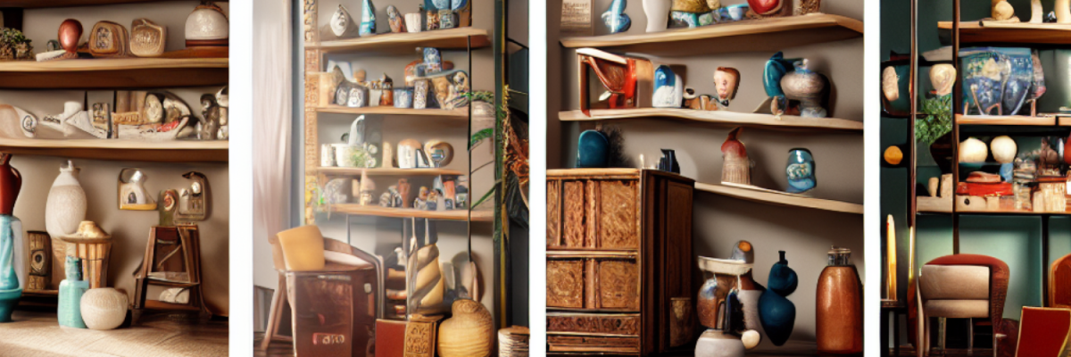
Exposições Figitais hospedadas em nossa plataforma.